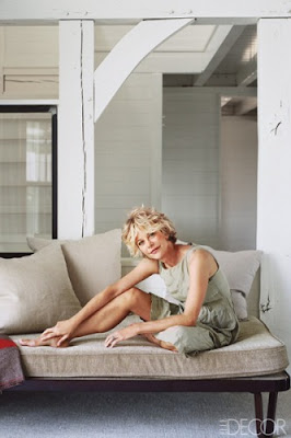
In onze zoektocht naar hoe sterren wonen, vonden we dit artikel in de “Elle Décor” over het huis waar Meg Ryan zich terugtrekt.
 |
| Courtasy of "Elle Décor" |
 |
| Courtasy of "Elle Décor" |
Het het verantwoord het strand gevoel op een goede manier door middel van veel hout, wit en aarde kleuren. Het is erg mooi, maar is het erg origineel? Hebben we dit niet eerder gezien?
 |
| Courtasy of "Elle Décor" |
Wel geven we flink wat punten voor de keuken, die we echt geweldig vinden. Er is een geweldig licht effect met de ramen en combinatie van zwart met prachtige houte kookeiland. Alles past perfect, zelfs de barkrukken zijn fantastisch.
 |
| Courtasy of "Elle Décor" |
Klik op 'Read in English' om ook het artikel uit de "Elle Décor" te lezen
Living with the stars part 2 - Meg Ryan
In our search on how the celebrities live we have found this article in the “Elle Décor” about Meg Ryan get away.
 |
| Courtasy of "Elle Décor" |
The place Martha’s Vineyard – full of other celebrities, so someone could wonder about the originality of the location, but let assume that Meg wants to live surround by stars.
The house well represents the beach filling with a lot of wood, white and earth tones. It is definitely beautiful but is it very original though? Haven’t we seen it already?
 |
| Courtasy of "Elle Décor" |
Our full credit goes to the kitchen we just loved it. There is just the amazing light affect with the windows and combination of black with wonderful wooden island. Everything perfectly fits even the island stool is so fantastic.
 |
| Courtasy of "Elle Décor" |
 |
| Courtasy of "Elle Décor" |
Here is a part of the article in "Elle Décor"
Several years ago, Ryan was looking for a refuge where she could spend time with her two children. A Connecticut native, Ryan is drawn to seaside communities along the northern Atlantic. “The light in that part of the country is the most beautiful light ever,” she says.
On a visit to Martha’s Vineyard, Ryan fell in love with a large cedar-shingled house on a seven-acre property. “It’s absolutely beautiful, just operatic,” she says. “It’s situated on a small rise and surrounded by water. The sun rises over a shallow bay on one side of the house and sets over a deep harbor on the other. And then the moon comes up over the bay.”
But if the setting was perfect, the house itself was less than ideal. The post-and-beam home had been built more than a decade earlier in England, where the parts were collapsed into a puzzlelike kit and barged across the ocean to be reassembled on-site. Ryan appreciated the craftsmanship of the house, but felt that the structure was unfinished. It was as cavernous as a barn, with its beams and rafters fully exposed. “It’s a sturdy thing that has survived nor’easters,” Ryan says. “But post-and-beam design is about seeing the skeleton of the house. I needed walls—I had to come in and add the skin.”
Ryan decorated the place with help from Marsha Russell of Satinwood, an interior-design firm based in Bedford, New York. “Meg wanted someone to bounce ideas off and to find things for her,” Russell says. “But she’s the visionary on this project. She has a wonderful aesthetic and a great eye.”
Ryan says her goal was counterintuitive: to add to the structure of the house with the ultimate goal of simplifying the space. With Russell’s help, she carved the massive interior into discrete rooms, separating the kitchen from the great room and the master bath from the bedroom. She created a series of cozy areas, including a breakfast nook, a computer room, and an upstairs playroom for the children. “It’s funny,” Ryan says. “Usually I go into a space and say, ‘What’s that wall doing there? Let’s take it out.’ This time I said, ‘Let’s put a wall there.’” The separations consist of glass doors, steel-framed casement windows, and walls with inset windows or transoms, so every room has glorious views.
When Ryan moved in, the decor was dark and drab, with orange-brown wood and a red ceiling and walls. She covered every surface with one of several different shades of Farrow & Ball white paint. The interior design is similarly understated, a mixture of industrial and vintage lighting, hand-hewn wood furniture, and sofas and armchairs slipcovered in pale linen. “I love what you might call brutal elegance,” Ryan says, “where form and function are really obvious.


No comments:
Post a Comment